Italics: You are losing readers over this tiny copy mistake
Want to know the quickest way to make people skip your content? Hint: it’s not your ideas, it’s the way you’re styling your words. A little italics goes a long way… but too much can slow your readers down.
About Italics
Italics take longer for your eyes and brain to process the written information
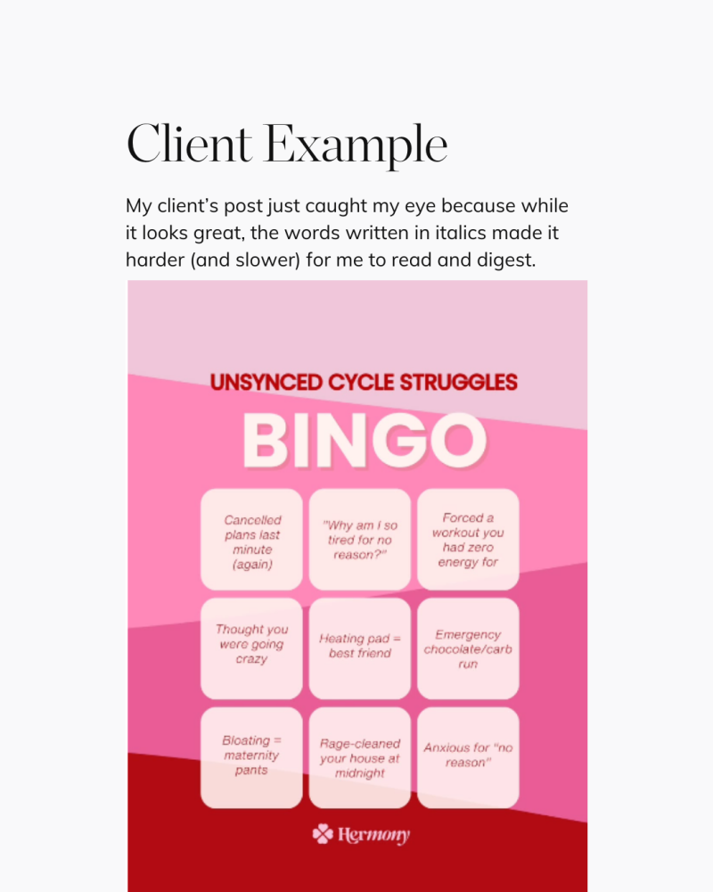
How you present when communicating for your brand matters as much as what you say (brand language) and how you say it (tone of voice). When you use italics like in the client example instead of straight letters, you increase your audience’s cognitive load.
By human nature we will always choose the easier path of less resistance. If you use italics instead of straight letters, there is a higher chance your audience will bounce and not stop to read or engage with your content; simply because subconsciously their brain flags it as “more work”.
What to do instead
Use Italics more strategically:
Italics are harder to read in body copy and especially on screens, so reserve where you want to create intentional emphasis only.
Best Practice
- Emphasize a key phrase or concept
- Name publications, books, or titles
- Foreign words or phrases that stand apart from your main text
- Callouts where you’re deliberately slowing the reader down to absorb something important
Make your words effortless to read, and watch your content actually get the attention it deserves.
P.S. If you’re reading this and wondering if your content might be secretly turning readers away without you noticing, I can help. In just 60 minutes, I’ll show you the small tweaks that make your posts easier to read and more engaging with a Brand Accelerator strategy session.
Speak soon